DataRovers
Make the numbers explain themselves.
An analytics platform that helps healthcare billing teams work from the headline numbers down to the reasons behind denied claims.
- Role
- Freelance Product Designer
- Timeline
- 2023
- Scope
- Medical claims analytics, data visualization, design system
- Status
- Web application
The problem
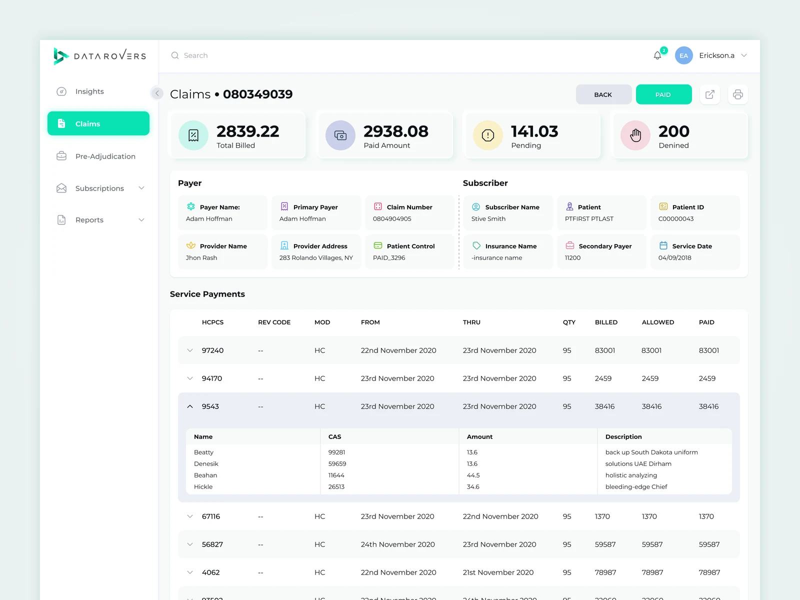
The answers were spread across claim files, payer rules and adjustment codes. Billing teams needed to investigate the gap between billed and paid without relying on an analyst to translate it.
My part
I designed the analytics workflows and a documented UI kit, with table density, alignment and drill-down behavior treated as core product decisions.
Key decisions
Summarize, then let people investigate
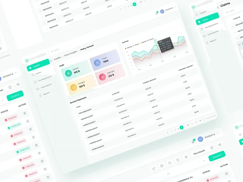
The opening view connects claims, payments and write-offs to the charts beneath them. A headline number becomes a route into the detail.
Put the gap beside the status
The claims queue keeps billed totals, payment, patient responsibility and status together. The difference being investigated is visible without another click.
Keep the thread through the drill-down
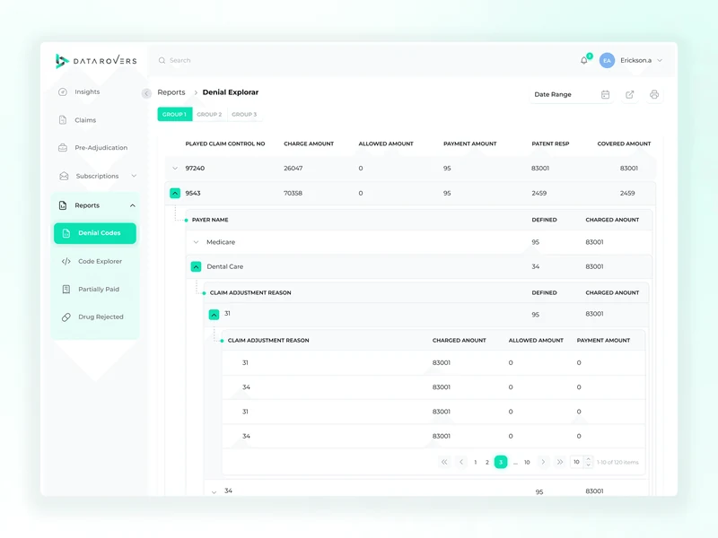
The denial explorer moves from payer to adjustment reason and individual line items while preserving context and comparable columns.
Build the system around tables
Density, alignment and truncation rules came before the decorative shell. The documented kit lets the team extend the product using the same visual grammar.
Where it landed
A readable claims analytics experience and a documented UI kit for expanding the platform.
See the original write-up