OnePulse
One system. Both sides of the survey.
Researchers create surveys on the web. Respondents answer on their phones. I redesigned the core platforms and documented the system that connects them.
- Role
- UX/UI Designer
- Timeline
- February 2022 - February 2023
- Scope
- Survey experience, mobile app, cross-platform design system
- Status
- Web & mobile
The problem
The product had outgrown its interface. Survey creation was slow, and web and mobile were drifting apart as new features were introduced.
My part
I led the redesign of the core mobile and web survey platforms and owned cross-platform design system documentation, bringing the researcher and respondent experiences into a consistent framework.
Key decisions
Give both products one system
The work started with a documented shared foundation, rather than allowing two interfaces to diverge with every release.
Set the contract at onboarding
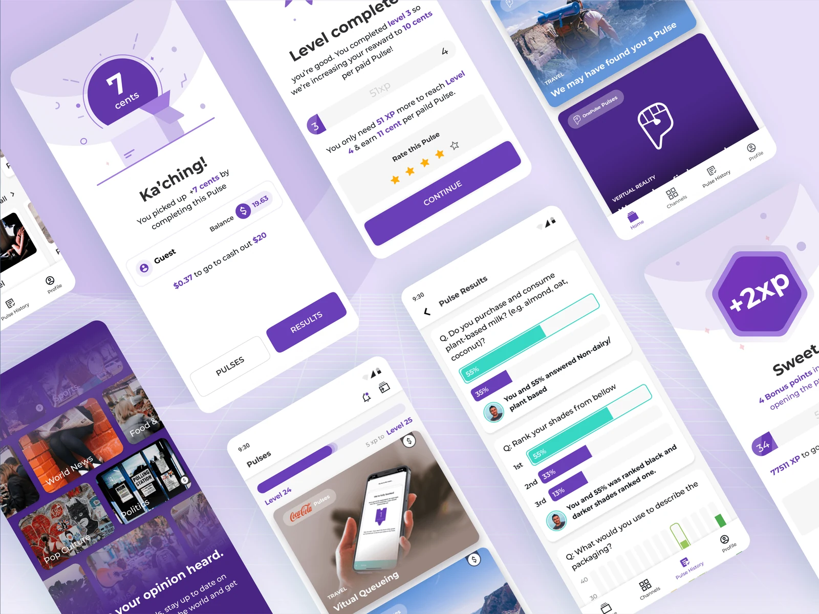
The mobile app explains what answering a pulse involves before asking for a commitment, keeping the first survey approachable.
Make discovery feel like a feed
Pulses show their subject before the ask. Respondents can choose what interests them, instead of working through a queue of unexplained tasks.
Organize around interests
Channels bring together pulses by topics such as entertainment, sport and food, making it easier to find relevant questions.
Where it landed
A redesigned survey experience and documented cross-platform system for the web and mobile teams.
See the original write-up